Jan Brueghel the Elder
River Landscape, 1607
Oil on Copper
National Gallery of Art, Washington, DC
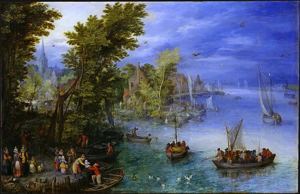
In 1607, Jan Brueghel the Elder used oil on copper to create “River Landscape”. The light (90) in this work is shown coming through the dark sky in the upper left corner. This is evident through the break in the clouds and the light shining on the water in the front right of the painting. The area in front of the light is shown in detail with the area behind are shown as if in a fog. This painting is also very asymmetrical (129). The weight of the work is on the left side and the right side of the work is much less busy and painted in lighter colors.
Richard Parkes Bonington
The Grand Canal, 1826/1827
Oil on Canvas
National Gallery of Art, Washington, DC
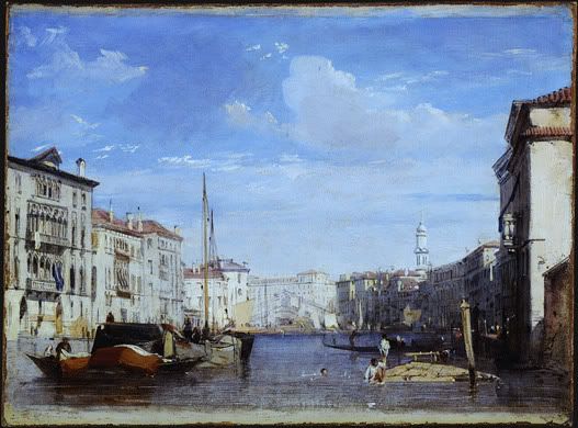
“The Grand Canal” is an oil on canvas piece created in 1826/1827 by Richard Parkes Bonington. He utilized several visual and design elements to create this beautiful scene. The first is atmospheric perspective (113). This is a technique that is “based on the observation that distant objects appear less distinct, paler, and bluer than nearby objects due to the way moisture and the intervening atmosphere scatters light”. In this painting the buildings in the back of the work take on a light blue tint from the sky making them appear far away in the distance. Light (90) is another element utilized by the artist. In this work, the buildings on the right side of the painting are shaded on the front because the light in the painting is shining from high in the sky on the right. This is also obvious because the buildings on the left are bathed in light. Scale (136) is evident in this work because the buildings start out large at the front of the painting and as the view looks toward the back of the canal the buildings get smaller. Scale is the size in relation to normal size. The use of scale draws the viewers’ attention down the canal.
Auguste Renoir
The Blue River, c. 1890/1900
Oil on Canvas
National Gallery of Art, Washington, DC
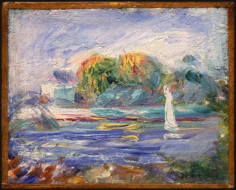
“The Blue River” was created with oil on canvas around 1890-1900 by Auguste Renoir. When first looking at this piece, the eye is drawn to the statute in the water. Renoir emphasized (134) this statue by painting it pure white. This is the only pure white in the work. He also used an open palette. A palette describes the range of colors used in a work and an open palette is one in which all colors are permitted (98, 586). This work utilizes yellow, red, blue, and green as well as various shades and tints of them. The work is also a-symmetrical (129). This is evident because the right side of the work contains most of the visual weight. Visual weight refers to the apparent “heaviness” or “lightness” of the forms arranged in a composition, as gauged by how insistently they draw the viewers’ eyes (125). The viewers’ eyes are drawn to the statue on the right side of this work.
Claude Monet
The Japanese Footbridge, 1899
Oil on Canvas
National Gallery of Art, Washington, DC
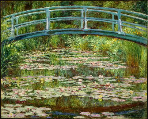
Claude Monet created “The Japanese Footbridge” in 1899 with oil on canvas. Color is a major element of this work. First, the colors used in this work, shades of green, yellow, blue and red, are analogous colors (97). These are a combination of colors adjacent to one another on the color wheel. The viewer sees these colors throughout the work. Monet also used color to highlight the focal point (134) of the work. A focal point is created when one area of a work is emphasized. It is easy to see the bridge is the focal point because of the use of the color blue. This is the only place in the work where blue is utilized. The water is not even blue, it is used to reflect the grasses and the colors in them. Finally, the grasses, bridge, and water are all painted in the same portions as they would be in reality, meaning the scale (136) is the same as one would see in nature.
Maurice de Vlaminck
Tugboat on the Seine, Chatou, 1906
Oil on Canvas
National Gallery of Art, Washington, DC
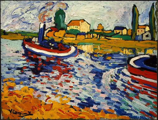
In 1906, Maurice de Valminck created “Tugboat on the Seine, Chatou” utilizing oil on canvas. He used primary colors (red, yellow and blue), as well as secondary colors (orange and green) to create this work (95). By using all these colors it is apparent that he was using an open palette like Renoir did when creating this piece. Movement (84) is created in this work by the heavy brush strokes and their direction in the water. The water is portrayed running around the front of the second boat which shows that the boats are moving upstream from the way the water is running.
John Marin
Middle of Atlantic, 1909
Watercolor on Wove Paper
National Gallery of Art, Washington, DC
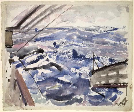
John Marin used watercolor on wove paper in 1909 to create “Middle of the Atlantic”. This piece is created solely with black and blue paint. These are cool colors (95). This color choice makes the work appear melancholy. The sky is grey and the water is dark blue and black and painted to make the water appear choppy. The view might assume that there is a storm brewing in this painting. Marin used a restricted palette (98), which is the use of few colors in a work. He only uses the two colors and then he mixes them to get various tints of blue, black and grey.
No comments:
Post a Comment